The Resi Dashboard is a crucial tool for our customers when taking on a home project, and we’re incredibly excited to announce it’s upgrading!
Using feedback from hundreds of homeowners, our in-house tech team are in the process of upgrading the Resi online customer experience - and you can be part of the journey.
If you’re a Resi customer, you can be one of the first to test the brand new features, helping to shape version 3 of the Dashboard. Even if you’re not a Resi customer (yet), here’s what features you’ll be able to explore in the future...
What is the Resi Dashboard?
The Resi Dashboard is our self-built online platform which allows customers to manage their home projects whenever and wherever, whether on a computer, tablet or phone.
From one easy to use platform, Resi customers can:
- Project manage. Any time, anyplace, Resi customers can manage their projects with step by step assistance and all documents to hand.
- Communicate. Our built-in instant messenger means customers can ask questions and share their latest home ideas as soon as they pop into their heads.
- Share. Customers can upload files and web links directly to the Dashboard so the Resi team can see what they’re trying to achieve.
- Walkthrough. With screensharing technology, our team can guide customers through the designs and drawings for their home projects.
- Track payments. Our transparent payment plans are broken up into manageable milestones, which can be tracked and paid securely from the Dashboard.
Why does the Dashboard need to be upgraded?
Our online customer experience was originally designed to track the progress of architectural designs, but since then we’ve grown substantially as a business, adding even more services to our journey.
In addition to measured surveys, architectural design, planning, and building regulations, we now offer:
Connect: Whether looking for the perfect builder, supplier, or specialist, our Connect service introduces customers to vetted local professionals.
Finance: Financial services tailor-made for homeowners, meaning customers can get the funds they need to unlock their home’s potential.
These expansions, as well as growth elsewhere in the business, meant the Dashboard had room for improvement. Upgrading was a no-brainer!
What’s changed?
The new Dashboard has been completely reimagined to bring an improved experience for our newer Connect and Finance services, whilst maintaining the same visibility for existing stages.
In addition to increasing the visibility of these new services, we’ve also designed a whole new visual style. This new style lets us include more information and detail about our teams and introduces some handy new tools. It even comes with greater flexibility, so we can continue to enhance the Dashboard in months to come.
Here’s what it looks like…

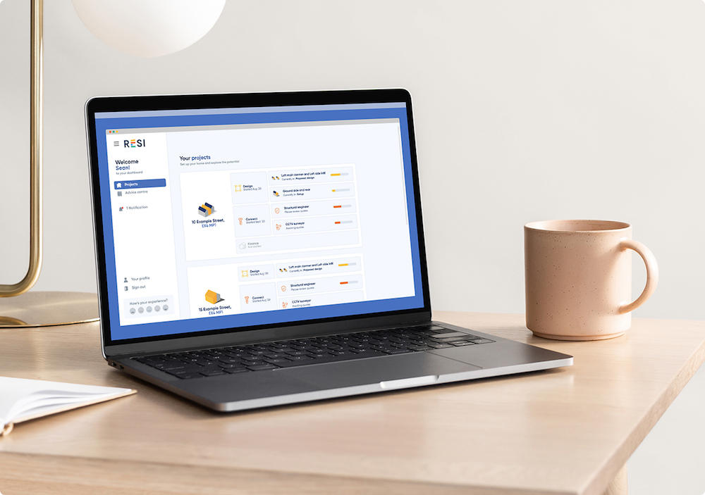
This top level overview of your projects allows you to see a birds-eye view of everything that’s going on right now. You can manage multiple projects simultaneously from here, clicking into Design, Connect or Finance for more information on each service.
You can also dive straight into a live architectural design project, supplier search or finance application, all from this one view.

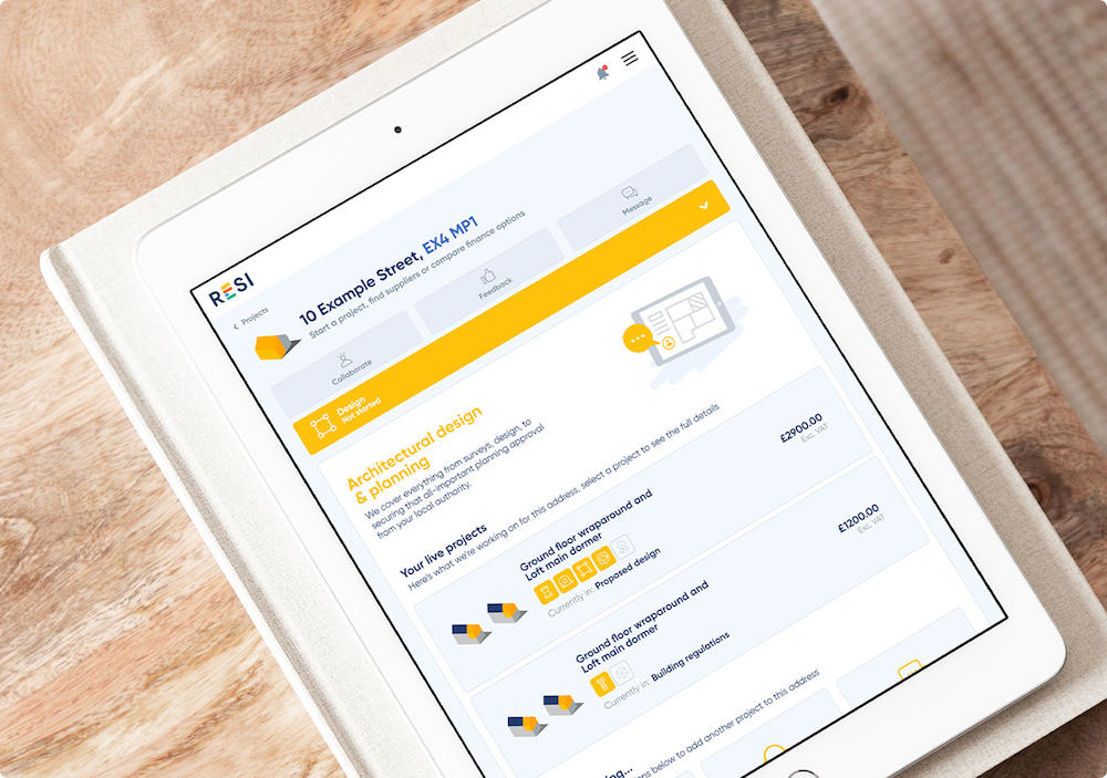
A level deeper, you’re able to begin exploring each area of your project. Are you embarking on an architectural or planning journey with us? Looking for a local supplier or contractor? Want to see which financial options are available for funding your project? Everything you need is available here in one easily navigable interface.
Whichever service or services you are utilising, we’ve brought together a collection of tools and resources to empower you on your journey, bringing transparency and honesty to the home transformation process. This is also something we can continue to build on, with videos and interactive content tailored to your specific project type.

We’ve also upgraded the existing architectural design and planning project experience, bringing the ‘File Library’, ‘Billing’ and ‘Message Inbox’ into the context of the current project stage. We’ve done this with an extremely practical new sidebar function, which enables you to do more from a single location on-site, rather than having to navigate multiple pages.
With this comes a new notifications feature, alerting you to your payment milestones and messages from our team. This has the potential to be expanded further in the near-future, letting you know when projects have progressed through each stage. Perfect for those with multiple projects on the go.
Want to start using the new Dashboard now?
This newest version of the customer dashboard is currently in its testing phase, and we are inviting a small number of lucky users to try the new experience before anyone else.
If you want to try the new features and are open to providing feedback, please email [email protected] and we’ll hand you access to the new dashboard on your next login!
If you are chosen, you will receive a prompt like this:

Tapping this prompt will transport you to our beta dashboard where you can try out the new experience. If at any time you wish to revert to the existing dashboard, there is a button available that will make this happen, with the option to leave any feedback you may have.
If this sounds like something you want to try, please email [email protected] today!


